How to visualize and interpret Life Cycle Assessment (LCA) results?
LCA results can help decision-makers identify and evaluate the environmental impacts of their processes. Effective visualization is crucial for accurate interpretation of LCA results and to derive the right conclusions. These sections here highlight common ways of visualizing results - how to read the charts and key things to note when trying to understand the results.
Source: https://constructsteel.org/solutions/life-cycle-assessment-report/
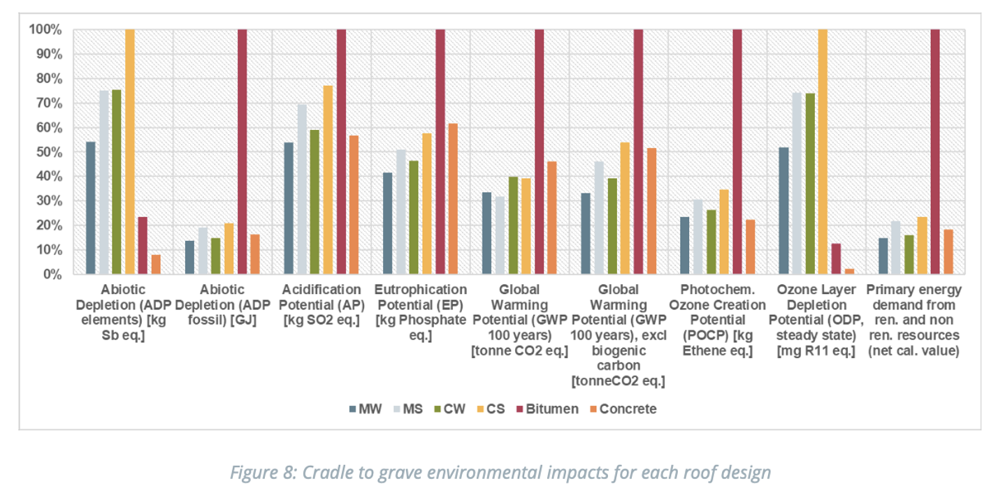
What does the graph show?
-
The diagram (Fig. 8) visualizes relative impacts in 9 different environmental categories for six different roof designs
- Scale: Expressed in % for easier comparison across impact categories
- The relative impacts are internally normalized
- i.e. in the case of Abiotic Depletion and Ozone Layer Depletion the CS roof has the highest impact and impacts of other roof types are shown relative to the CS roof; in other environmental categories, the impacts of bitumen are used for normalization and impacts of all other roof types are shown relative to bitumen
What's the value of showing data in this format?
-
Provides an overview of several products and impact categories in one single graph
- Allows us to identify which roofing system in comparison to others may have highest or lowest environmental impacts for a variety of environmental impact categories
- Not only focuses on one environmental impact and shows whether the system that leads in one environmental category is also the most preferable in other categories e.g.; one option may perform fairly well in one environmental impact category but result in more negative impact in another category. This can allow us to identify potential trade-offs.
Points of interest:
-
It would not be possible to present the same information in absolute values because
- they carry different units (Abiotic (fossil) depletion is measured in GJ, Global Warming Potential in tonnes CO2eq)
- Even if they, have similar units such as kg they should not be put in the same graph because e.g. the impact on ocean eutrophication of 3 kg of Phosphate cannot be directly compared to the harmfulness of 3 kg of R11eq on the Ozone layer)
- The graphic can be a bit misleading, since values are plotted in %, yet each environmental category shows additionally the unit in which the impact is measured (e.g. tonne CO2equ )
Source: https://constructsteel.org/solutions/life-cycle-assessment-report/
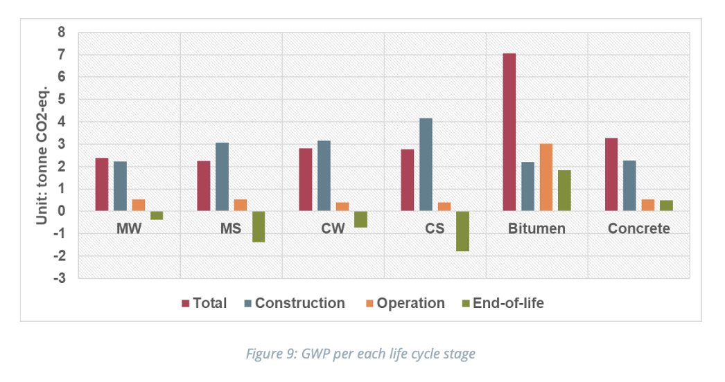
What does the graph show?
-
Diagram shows absolute impacts in just one environmental impact category for all 6 roof designs (i.e. Greenhouse gas emissions shown in CO2eq). Similar diagrams can also be generated for other environmental impacts of concern.
What's the value of showing data in this format?
- Allows us to identify which life cycle stage (i.e. Fig. 9) within a system contributes most (i.e. hotspot analysis) to a particular environmental impact, so that more focused efforts can be directed towards addressing it
Points of interest:
- Bar chart (Fig. 9): Besides the total impact, the graph lists the origin of the Greenhouse gas emissions by life cycle stage (here: construction, operation and end of life)
- Note: There are different kinds of environmental impacts, and LCA allows a parallel assessment of them. Carbon footprint (Global Warming Potential) is only one of many LCA categories but attracts the most attention due to its global scale and severity of impacts globally
Source: https://constructsteel.org/solutions/life-cycle-assessment-report/
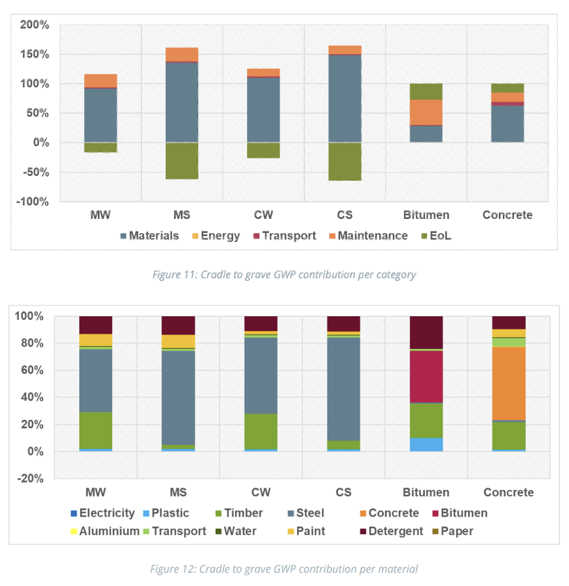
What do the graphs show?
-
Diagram reflects relative impacts in one environmental impact category for all 6 roof designs (i.e. Greenhouse gas emissions shown in CO2eq)
What's the value of showing data in this format?
-
Finer analysis of LCA results available when mapped against other types of information (e.g. materials that go into the roofing system in this e.g.)
-
Allow us to identify which category in a life cycle (Fig. 11) or material (Fig. 12) contributes most to a particular environmental impact (hotspot analysis) , so that more focused efforts can be directed towards addressing such hotspots
-
A comparison of impacts of different roofing systems in one graph highlight that hotspots can vary between different roofing systems (e.g., impacts of MW, MS, CW, CS are dominated by the life cycle impacts of steel and timber, while bitumen roofing's impacts result from life cycle impacts of bitumen, timber and detergent)
Points of interest:
-
Why is there a Scale of more than 100% for Fig. 11? Different material (e.g. wood) or processes (Waste to energy) can be counted as negative emissions since they remove CO2 from the atmosphere or can avoid CO2 emissions (Electricity generated from Waste incineration may create less CO2eq/kWh than electricity from burning fossil fuel (as in the majority of national fuel mix globally)
-
100%-stacked bar graph format (Fig 12) displays each material as a proportion of the whole system for ease of understanding contribution from a particular material compared to another material in that system.